

Wayfinding Signs for Offices That Work
- Charlie Hung
- 13 hours ago
- 6 min read
A visitor should not have to stop at the lobby, look around, and guess where reception, suites, restrooms, or conference rooms are located. That is the basic job of wayfinding signs for offices - reduce hesitation, keep people moving, and make the space feel organized from the first step inside.
In office environments, wayfinding is not a single sign at the front door. It is a coordinated system that helps employees, clients, vendors, interview candidates, and delivery drivers move through the building without needing constant staff direction. When the signage is planned correctly, it supports daily operations, reinforces brand standards, and addresses code-driven requirements at the same time.
What wayfinding signs for offices need to do
Office wayfinding has a practical job before it has a design job. People need to understand where they are, where they need to go, and what they should do next. If a sign system looks polished but creates confusion, it is not doing its job.
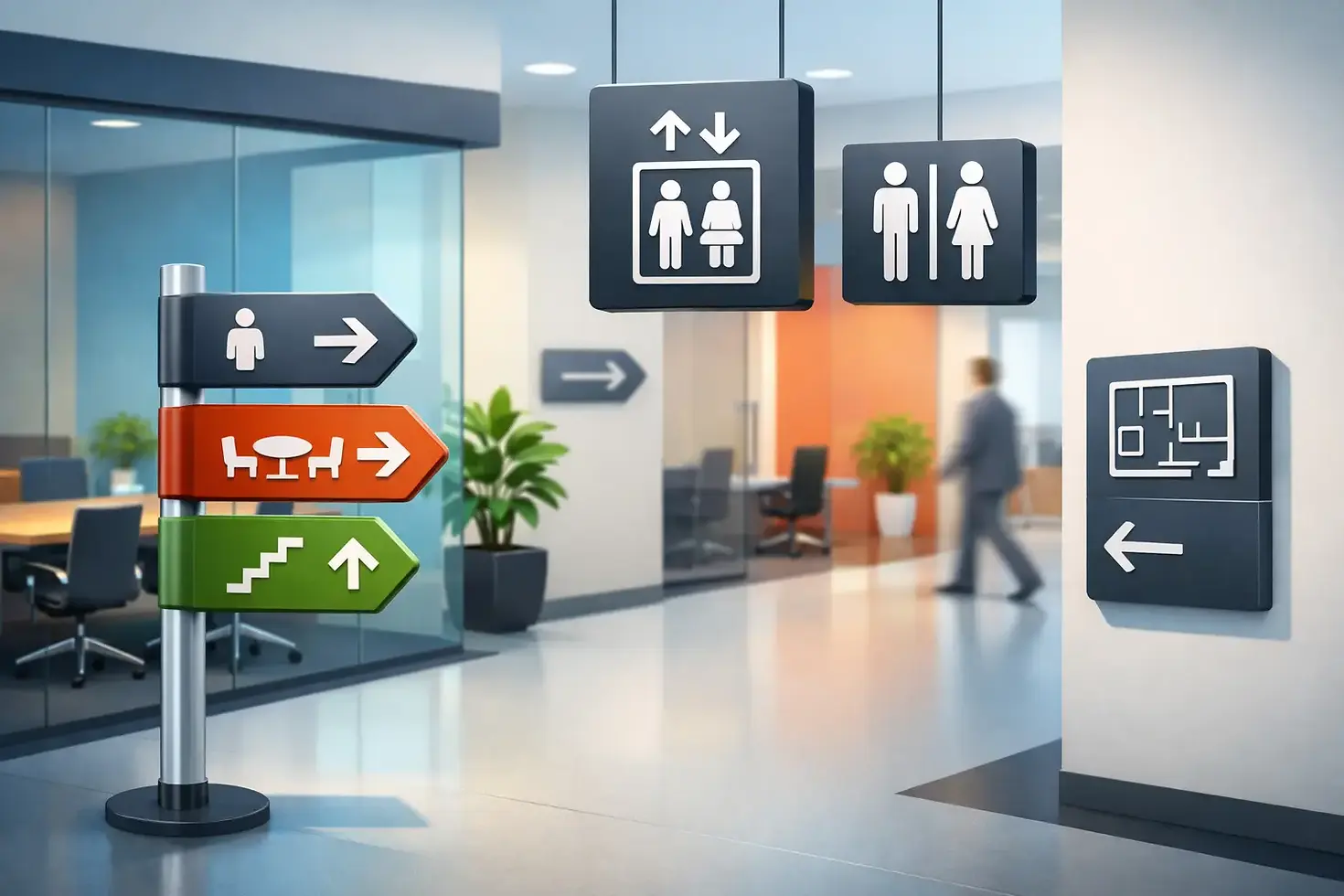
Most office projects need several layers of information. Building entry signs identify the location. Lobby directories show tenant names or departments. Corridor signs direct foot traffic to key destinations. Room identification signs label conference rooms, offices, restrooms, and utility spaces. ADA signage supports accessibility requirements. In larger workplaces, evacuation plans and life safety graphics may also need to align visually with the rest of the environment.
The exact mix depends on the building. A single-tenant headquarters has different needs than a multi-suite professional office, medical office, or mixed-use property. That is why wayfinding works best when it is scoped as a full environment rather than ordered one sign at a time.
Common office sign types in a complete system
A functional office wayfinding package usually combines architectural signage with regulatory and branded elements. In practice, that often includes lobby directories, suite number signs, room name plates, restroom signs, directional arrows, stair and elevator identifiers, ADA-compliant room signs, frosted window graphics, wall-mounted branded markers, and evacuation plans where required.
Some projects also need stand signs, vinyl graphics, or dimensional lettering to help define zones within larger interiors. For example, a tech office may use wall graphics to distinguish departments, while a professional services firm may prioritize understated room identification and polished directory panels. The materials, mounting methods, and finish level should match the interior build-out rather than compete with it.
This is where custom fabrication matters. Standard sign kits can work in basic settings, but they often fall short when a client needs consistency across multiple floors, branded finishes, or integration with an architect's material palette.
Why office wayfinding often fails
The most common problem is not poor fabrication. It is poor planning. Signs get added late in the project, after furniture layouts change, departments move, or compliance items are treated separately from branded signage. The result is a patchwork system with inconsistent fonts, mismatched mounting heights, and too much information in the wrong places.
Another common issue is over-signing. When every turn has competing messages, people stop processing the information. A better system uses fewer signs, placed where decisions actually happen - at entries, intersections, elevator lobbies, and destination doors.
Naming also causes problems. If internal teams call a room the "boardroom" but the sign says "conference 1," visitors will still ask for help. The wording on signs needs to match how people actually refer to spaces.
Planning wayfinding signs for offices during build-out or renovation
The best time to plan signage is during design development, not after punch list. That gives enough room to coordinate room names, ADA requirements, branding standards, wall conditions, and installation access before fabrication starts.
For office build-outs, the sign package should be reviewed alongside floor plans, reflected ceiling plans, and finish schedules. This helps avoid practical conflicts such as placing signs on glass without the right mounting approach, selecting materials that do not suit the wall surface, or discovering too late that code-required signs were missed.
Renovation projects need a different approach. Existing offices often have partial sign systems, outdated directories, tenant changes, and surfaces that do not match from area to area. In those cases, a site survey becomes critical. It is the fastest way to identify what should be replaced, what can be updated, and what needs a completely new standard.
ADA and compliance are part of the system
In offices, accessibility signage should not be treated as an afterthought. ADA room signs, restroom identifiers, exit-related graphics, and evacuation plans all affect how the environment functions. These signs must meet specific requirements for placement, legibility, tactile elements, braille, and contrast where applicable.
There is also a design balance to manage. Compliance signs need to perform technically, but they can still be fabricated to fit the overall look of the office. Materials, colors, and mounting details can be selected so that required signs feel integrated rather than visually disconnected.
For property managers and facilities teams, this matters for another reason: replacement cycles. A sign system built with consistency in mind is easier to maintain when departments move, suites change hands, or room functions are reassigned.
Materials and finishes affect performance
In office interiors, the right material depends on the traffic level, brand style, and installation surface. Acrylic panels work well for directories and modern room signs. Metal and brushed finishes can support a more architectural look. Engraved signs are often chosen for durability and clarity. Vinyl graphics and frosted window film help carry wayfinding onto glass and partition systems without adding visual bulk.
There is no single best material for every office. A high-end lobby may call for dimensional elements and premium finishes, while a back-office corridor may need straightforward, durable identification that is easy to update. The main objective is consistency. If every sign category looks like it came from a different vendor, the office starts to feel fragmented.
That is one reason many Bay Area businesses prefer working with one partner for design, fabrication, and installation. Coordination is simpler, finish standards stay aligned, and field adjustments can be handled without passing responsibility between multiple vendors.
Branding should support navigation, not compete with it
Office signage is often expected to carry brand identity, especially in client-facing spaces. That makes sense. Reception areas, lobby directories, wall logos, and interior environmental graphics all shape how the business is perceived.
But branding and wayfinding are not identical goals. A dramatic feature wall can anchor a lobby, yet it does not replace directional signage. Likewise, a branded room plaque still needs to be readable from the right distance. The best systems use brand standards as a framework for typography, color, and finish while keeping navigation simple.
This balance becomes especially important in multi-tenant buildings or shared office environments. Tenant branding needs to be visible, but the property also needs a consistent navigation structure that works across all common areas.
Installation details matter more than many teams expect
Even well-designed signs can underperform if installation is rushed. Placement height, sightlines, lighting conditions, wall substrate, and hardware selection all affect readability and appearance. In offices, this gets complicated quickly because interiors may include painted drywall, glass fronts, textured wallcoverings, millwork, and concrete surfaces within the same project.
Professional installation keeps the system looking intentional. It also helps prevent the common problems that show up later - crooked room signs, damaged walls, loose hardware, poor alignment at directories, and graphics that fail early because they were installed on the wrong surface or under the wrong conditions.
For occupied offices, scheduling matters too. Install work often needs to happen around business hours, tenant access, or phased occupancy. That is easier to manage when signage is produced and installed as part of one coordinated scope.
Choosing a vendor for office wayfinding
If you are sourcing wayfinding signs for offices, the real question is not just who can print a sign. It is who can translate plans into a complete sign package, fabricate across multiple sign types, and install with consistency across the space.
That usually means looking for a partner with experience in ADA signs, architectural signs, branded interior graphics, directories, room identification, and permit-related visuals such as evacuation plans. For Bay Area offices, it also helps to work with a local team that can survey the site, coordinate with contractors or facilities staff, and handle replacements as the space evolves. Urban Graphics Inc. works in that full-service model, which is often the most efficient path for office projects that need more than a few isolated signs.
A clear office should feel easy to move through. When people can find the right suite, meeting room, or amenity without asking for help, the space is doing what it should - supporting the business quietly, accurately, and every day.


Comments