


Custom Office Signs That Work Harder
- Charlie Hung
- 3 days ago
- 6 min read
A lobby wall with no identity, conference rooms labeled with paper printouts, and departments marked inconsistently all send the same message: the office was finished, but the experience was not. Custom office signs close that gap. They help employees, visitors, vendors, and tenants move through a space with less confusion while reinforcing the company behind it.
For Bay Area businesses, office signage usually needs to do more than look good. It has to support brand standards, fit the architecture, hold up to daily use, and in many cases satisfy accessibility and code requirements. That means the right sign package is rarely one sign. It is a coordinated set of visual and functional elements that work together across the full office environment.
What custom office signs need to accomplish
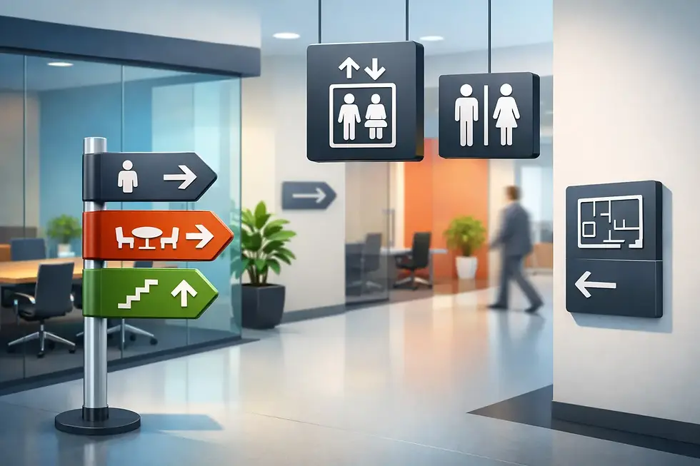
In a commercial setting, signage has a job to do. A front desk logo establishes presence the moment someone walks in. Suite signs help visitors confirm they are in the right place. Room identification signs reduce interruptions. Directional signs keep foot traffic moving. ADA signage supports access and compliance. Frosted graphics add privacy without closing off light.
The best custom office signs handle several of these needs at once. They present the brand clearly, organize the space, and match the level of finish the business wants clients and staff to see. In a law office, that may mean understated dimensional lettering and engraved room signs. In a tech workspace, it may lean toward wall graphics, privacy film, and a more contemporary material palette. In a medical or multi-tenant property, wayfinding and compliance may carry more weight than visual branding alone.
That balance matters because office signage is not one-size-fits-all. A sign system that looks sharp in a showroom may not be practical in a high-traffic corridor. A premium material may be worth it in a reception area but unnecessary for a back-office marker. Good planning starts with knowing which signs are customer-facing, which are operational, and which are required.
Core types of custom office signs
Most offices need a combination of branded, directional, and informational signage. The mix changes by industry, floor plan, and how the space is used.
Lobby and reception signs
This is usually the focal point. Dimensional letters, acrylic panels, metal logos, standoff-mounted plaques, and illuminated features are common choices for reception areas. The main question is not whether the sign should stand out. It is how prominently it should do so within the design of the space.
A restrained brand mark can feel right in a professional office with polished finishes and quiet architecture. A larger 3D logo or lit sign may make more sense when the business wants stronger visual impact or the lobby has enough scale to support it. Material selection matters here because reception signs are viewed up close. Finish quality, edge detail, mounting method, and lighting all show.
ADA and room identification signs
These signs are functional, but they should still feel integrated into the office. Restrooms, exits, conference rooms, break rooms, and permanent spaces often require consistent identification, and ADA signs have specific standards for tactile characters, braille, placement, and contrast.
This is one of the most common places where businesses try to solve a design problem too late. If ADA signs are treated as an afterthought, they can end up looking disconnected from the rest of the interior package. When planned from the start, they can be fabricated to match brand colors, materials, and mounting styles while still meeting requirements.
Directional and wayfinding signs
Wayfinding becomes more important as offices get larger, shared, or more segmented. Visitors should be able to find reception, meeting rooms, elevators, restrooms, and departments without stopping someone for help every few minutes.
In smaller offices, wayfinding may be simple and minimal. In larger suites, medical offices, or multi-floor environments, it needs a more deliberate system. That can include wall-mounted directional signs, suspended signs, directory panels, and suite identifiers. The goal is clarity first. Decorative signage that slows comprehension does not do its job.
Window graphics and privacy film
Glass-heavy offices often need a middle ground between openness and privacy. Frosted window graphics are a practical solution for conference rooms, private offices, and entry partitions. They help define space, reduce distraction, and create a cleaner visual line across the interior.
These graphics also carry branding value. A simple frost band can add safety and privacy. A custom cut pattern or logo treatment can extend the brand without making the space feel busy. In offices with multiple glass fronts, consistency in these treatments makes a noticeable difference.
Wall graphics and environmental branding
Some offices need more than identification. They need the interior to express culture, values, services, or history. Wall murals, branded graphics, mission statements, timeline walls, and department graphics can turn blank surfaces into usable brand real estate.
This works best when the content is selective and placed with intent. Too many visual messages compete with each other. The stronger approach is to identify high-visibility walls where branded graphics support the visitor journey or employee experience.
Choosing materials and finishes for office use
Material choice affects more than appearance. It changes durability, maintenance, budget, and how a sign reads in the space.
Acrylic is popular because it gives a clean, contemporary look and works well for lobby signs, room signs, and directories. Metal can add weight and permanence, particularly in executive or architectural settings. PVC and other fabricated substrates are often effective for dimensional letters and interior applications where cost control matters. Vinyl is flexible for graphics, privacy film, and temporary or changeable messaging. Engraved signage remains a strong option for room identification and compliance-focused applications.
There is always a trade-off. Premium finishes make sense in areas that define first impressions. For secondary zones, the better move may be durable, clean fabrication that holds up well without overspending. A complete office package usually benefits from mixing materials based on visibility, use, and replacement frequency.
Why a single sign vendor matters
Office signage projects can involve designers, facility managers, general contractors, landlords, and operations teams. The more pieces involved, the easier it is for inconsistencies to show up. Colors shift. Mounting heights vary. ADA signs arrive late. Graphics do not match the lobby branding. Installation gets pushed because measurements were off.
Working with one partner from design through fabrication and installation helps avoid that fragmentation. It streamlines approvals, keeps visual standards aligned, and reduces back-and-forth between separate vendors. For tenant improvements, office refreshes, and new locations, that coordination is often as valuable as the signs themselves.
Urban Graphics Inc. approaches office projects that way, with the ability to produce branded signs, ADA signs, wall graphics, window graphics, directories, and other supporting elements as one coordinated package. For commercial clients, that means fewer handoffs and a cleaner result.
Planning custom office signs before problems show up
The best time to scope signage is early, not after furniture is in and move-in is around the corner. Sign locations should be coordinated with walls, glazing, lighting, circulation paths, and accessibility requirements before the last minute. That is especially true for offices going through renovation, tenant improvement, or rebranding.
A practical signage plan usually starts with a site review and a list of required sign types. From there, finishes, dimensions, and mounting methods can be matched to the architecture and the brand. If the office includes permit-related posting, evacuation plans, or compliance signage, those items should be accounted for in the same process instead of handled separately later.
It also helps to think beyond day one. Departments move. Rooms get renamed. Teams expand. Some sign types should be built for permanence, while others should allow for updates without replacing an entire system. That distinction saves time and cost down the road.
What strong office signage looks like in practice
Strong office signage feels consistent without feeling repetitive. The brand is visible, but not forced into every surface. Required signs are compliant, but they do not look generic. Visitors know where to go. Staff do not waste time giving directions. The office feels finished because the visual details are working.
That result usually comes from straightforward decisions made well: the right sign types, the right materials, accurate fabrication, and clean installation. Not every office needs a dramatic statement piece. Many need a reliable package that covers reception, room IDs, ADA, privacy graphics, and wayfinding with a professional standard of finish.
If you are planning a new office, updating an existing suite, or standardizing signage across locations, treat signage as part of the build-out, not as a final decoration. Custom office signs do their best work when they are integrated into how the space functions every day. That is where they stop being extras and start becoming part of the operation.


Comments